


We recently shared how a few of our favorite apps mastered clean and simple customer onboarding by practicing empathy and designing with their customers in mind. We took a high-level look at their onboarding flows and what we love most about them. Those clean, sleek-looking onboarding flows are the amalgamation of many details—of many decisions. There are many steps from the design and development side that go into a seamless flow.
Of course, one of those steps is data collection via signup forms. As an app creator, you want to collect everything you’ll possibly need now and down the road. But your customers want a frictionless experience without having to do too much work or provide too much information about themselves. This is especially true in an age of rising privacy concerns.
Here are eight ways to create a cohesive signup flow that minimizes pain for your new mobile app user and allows you to collect the info you need to serve them the experience they’re expecting.
1. Streamline the signup process with social login
Love it or hate it (I’m on the fence most the time), allowing signup and log in via social media services like Facebook, Twitter, or Google saves customers time and effort in the onboarding process.
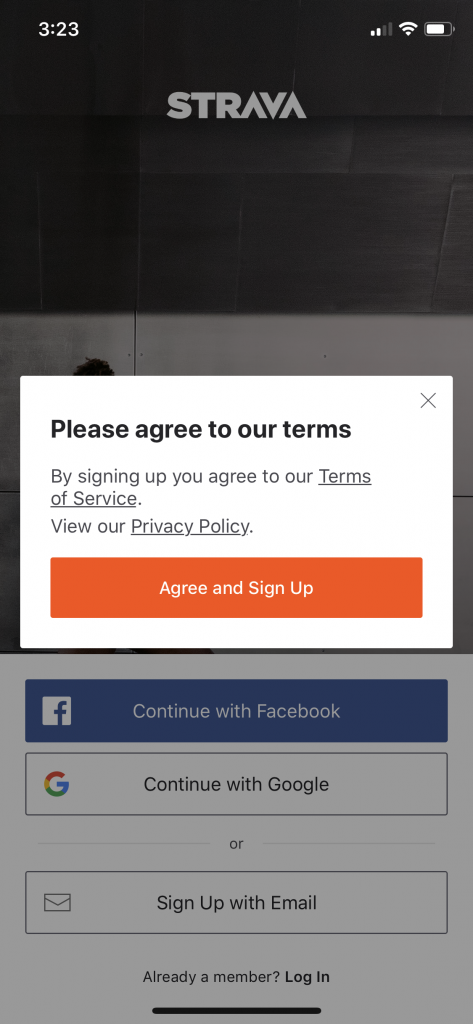
Apps like Strava and Medium are social networks themselves that leverage other social networks. Strava allows athletes to connect and compete with friends and fellow Strava community members. Medium is a place to read articles and share your own writing with your friends and followers.
Social authentication makes a lot of sense for both of these apps, as they encourage you to connect with people you already know on the app and invite others to join. That grows their user base and in-app engagement, and it makes for a better user experience.


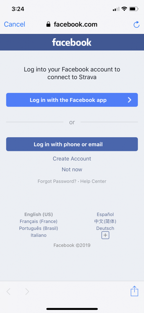


As seen above, there are still quite a few steps in the social authentication process but for whatever reason, clicking a few buttons feels like way less work than typing in my personal information.
Remember to assure people that their social data is secured and to disclose what information you’re gathering and why. Also, tell them what permissions you have and what can and cannot be posted via your app. People get nervous that their app activity will be shared on Facebook, for example, without them knowing.
Medium does a stellar job of clearly sharing exactly how they’ll use your social connection on a nicely designed and easy-to-read screen.


I enjoyed how easy Medium made it to switch my Twitter accounts. I’ve seen other apps – and probably even Medium back in the day – take a much clunkier approach. These details make a difference to a user signing up for your app. It’s painful when you have to type in a password for whatever social media app you’re using to create an account on a new app.
Usability Geek says to consider what social media apps your target customer is most likely using. Generation Z are known Snacphat fans, whereas millennials are Instagram and Facebook users. Twitter users defy demographics – but you know if your users are on there or not. Think beyond demographics to interests as well. For example, if your app is for recruitment, you’d probably want to offer signup via LinkedIn. I’d suggest for an app like Quora even to offer LinkedIn signup.

If you use social authentication, minimize user pain points with simplicity, be very clear with how their information will be used and/or posted, and try to require minimal steps or clicks from them.
If you use social media authentication, Optimizely suggests tracking these metrics to determine how your customers are interacting with it:
- Social sign-on CTA taps
- Social sign-on completed registrations
- Non-social completed registrations
- Bounce from onboarding and registered user attrition for those who used social sign on vs. not
- Average session length (to gauge engagement)
2. Make signup even easier with a magic link
If you’re joining Slack, you’ve likely been invited by someone else – unless you’re the creator of the group. Once you’ve downloaded the app and entered the email you’ve received the invitation to, Slack offers the option to click a magic link to authenticate your identity rather than creating a password.

They do the same when you log in after joining. This creates a two-click process that feels much easier than creating a password.
Idiot Inside shared how to create a similar “magic link” system for your app with Django.
3. Build trust while asking for an email
Immediately remind your new customer why they downloaded your app without being condescending, of course. They know why they’re there, but it’s important to make them feel great about their decision right away.

Both Hootsuite and Evernote share the benefits of their apps before asking you to share any of your information.


4. Only ask for a username and password if 100% necessary
Do your users really need to create a username or will an email address suffice just fine? MockPlus put it well, “The email vs username dilemma is a no-brainer when you think about it. Who remembers all those unique usernames you are supposed to come up with? And when I type in a brilliant username idea, chances are you will say, “it’s already taken”. So, save the trouble guys, and go for the email. You will ask that anyway for verification and other contact purposes, so it’s already a required item.”
If you don’t need loads of info from your customers for them to use your app, then don’t ask for it.
5. Ask for only the must-have permissions
If your app doesn’t need to know your users’ locations to do its intended function, don’t ask for it. Same goes for access to photos, microphones, etc. And if you do need access to photos, wait until the proper time to ask for them. If you have a social media app, for example, you probably don’t need access until your user is uploading a profile photo or attaching a photo to a post, sending it to another user.
By waiting until this moment to ask for permission, your user will understand why you’re asking. If you ask in the first few screens before they’re familiar with how it works, they might get freaked out and bounce.

I truly appreciated Strava asking me if they can email me rather than collecting my email regardless of how I’ll be interacting with the app. The answer to their question for me is “no” but I’ll be a happier and more loyal user without receiving emails from them.
6. Make password parameters clear
Rather than making your users guess what they need to include in their password then telling them they’re wrong, give them your password parameters up front. Things like character length, special characters needed, etc.

7. Present fields in a single column layout and always use labels
Stack all of your form fields on top of each other rather than next to one another. This keeps your users in a flow and makes them less likely to accidentally skip a field.

It drives me bonkers when a form uses place-holder text in the field box with no labels. I need both. Just because I started typing doesn’t mean I remember which field I’m working on. What if a co-worker distracts me? Label your field boxes and use placeholder texts to demonstrate the desired formatting.

8. Make data fields as user-friendly as possible
For some reason, I find most date or birth date fields incredibly annoying. I like Strava’s though. They use a clean and simple pop-up with scroll functionality for choosing the month, date, and year. I also enjoy that the default year isn’t on 2019 because it’s just annoying to scroll all the way back.

Wrapping it up
These tips only skim the surface of the detail that could (and arguably should) go into a signup form for your mobile app. Your users are busy and distracted. They want a simple and clean experience but they also want to feel thought of and seen by your technology. They want to know that their information is secure and that they’re going to enjoy their experience.
It’s easy to slap together a simple form and throw it into your app. It’s a true (and fun!) design and engineering challenge to turn a form into an enjoyable experience. Hopefully these tips help you do the latter!
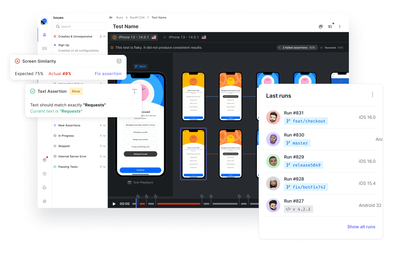
Visit Waldo if you want to learn more about codeless mobile automation testing.
Automated E2E tests for your mobile app
Get true E2E testing in minutes, not months.
.png)

.png)

