Waldo sessions now support scripting! – Learn more
App Development

React Native Scrollview 101: The Best Practices Guide

Siddhant Varma
Siddhant Varma
React Native Scrollview 101: The Best Practices Guide
June 4, 2021
16
min read

When mobile apps abruptly clip off content from the screen, it’s a sign of bad UX for developers. Moreover, not being able to scroll through your app’s screen could be confusing for your users. Luckily, scrolling containers provide a reliable solution to this problem.

This post presents a deep and comprehensive guide on React Native’s scrolling containers, which are called ScrollViews. You’ll understand what they are, write them in code, and explore some best practices with practical examples.

What’s Wrong With the View Component?

The most generic container used in React Native is the <View> component. You can use it to build complex UIs by nesting native as well as custom components like <Text>, <Image>, <TouchableOpacity>, etc.

However, it doesn’t account for overflow. As a result, when you render content that goes out of the bounds of a user’s screen, <View> will clip off all the overflowing content. Even with a fixed height around your containers, the content might overflow on devices with small screens.

waldo pull quote

ScrollView to the Rescue

ScrollView is a scrollable container that can nest one or more components inside it. It accounts for vertical as well as horizontal scrolling and gives a native scrolling experience to your users. Whenever your screen’s UI cannot be contained at a fixed height, you should implement a ScrollView.

Additionally, it gives a bunch of useful features as props. Let’s dive deeper into understanding them with code.

Creating a React Native Project Using Expo

If you’re new to Expo, you can get started with it here. Create a new Expo project by running


expo init react-native-scrollview-guide

Navigate into the project directory to jump-start your Expo project.


cd react-native-scrollview-guide && expo start

This will open the Expo project in your browser with a QR code that you can scan from the Expo app on your smartphone. Then, you can directly run your React Native app on your smartphone with live reloading.

Using ScrollView

For brevity, I’ll write all the code for this example inside App.js only. I also use a dummy image that you can download to follow me step by step.

The below code uses a <View> component as a generic container to wrap some <Text> and an <Image> component. It also has some styles to give some margins and padding to the <View> components.


import React from 'react';
import { Image, StyleSheet, Text, View } from 'react-native';
import hero from './assets/react-native.png'
export default function App() {
  return (
      <View style={styles.main}>
        <Text style={styles.header}>React Native ScrollViews 101</Text>
        <Text style={styles.subheader}>Your essential guide learning react native scrollviews</Text>
        <Image source={hero} style={{ width: 305, height: 300, marginVertical:20 }} />
        <View style={styles.content}>
          <Text style={styles.description}>
            In this roundup, I'll tell you all about React Native ScrollViews you need to know.
            React Native is a cross-platform mobile development framework based on ReactJS.
            In this section you'll learn about scrolling containers called scrollview.
            You will learn more on how scrollviews work and also look at some practical examples using props.
          </Text>
        </View>
      </View>
  );
}
const styles = StyleSheet.create({
  main:{
    marginHorizontal:20,
    marginVertical:40,
  },
  header:{
    fontSize:40,
    fontWeight:'700'
  },
  subheader:{
    marginVertical:20,
    fontSize:30,
    fontWeight:'500'
  },
  content:{
    paddingVertical:20
  },
  description:{
    fontSize:20,
  }
});

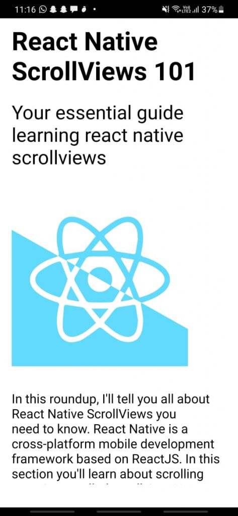
Notice how the last <Text> component abruptly clips off at the end of the screen:

Overflowing content gets clipped off when using the <View> component

If this was your app, your user wouldn’t be able to see the last line, as it gets cropped out of the screen. Also, the vertical margin at the bottom of the screen is barely visible. Your user might attempt to scroll down to view the full content but will not be able to do so.

To address this issue, replace the outermost <View> with a <ScrollView>. Make sure you also import it at the top.


import {ScrollView} from 'react-native';
export default function App() {
  return (
      <ScrollView style={styles.main}>
        ...
      </ScrollView>
  );
}

Notice how the vertical margin from the bottom appears on the screen.

Vertical margin visible from the bottom of the screen when using ScrollView

There’s also a thin, gray scrollbar that appears when you start to scroll down to see the entire content.

Overflowing content can be viewed on scrolling when using a ScrollView

That’s it! That’s how simple it is to use a ScrollView in your React Native app. Let’s look at a practical example to explore it further.

Building a Scrolling Profile Screen Using ScrollView

Most apps always have a dedicated profile screen where the authenticated user can see their details. Since profile screens can sometimes have a lot of content to display, you build them using a ScrollView.

Let’s build a simple and scrollable profile screen that has the following:

  • A sticky header with a back button
  • User’s profile picture, username, name, and bio
  • User-related stats such as followers, projects, etc.
  • Some action buttons to follow the user, connect to the user’s Instagram account, etc.
  • User’s posts fetched from external API
  • Pull-to-refresh functionality

To get started, create the following files and folders:

Profile screen folder structure

Creating Global Style Sheet

Inside the GlobalStyles.js folder, add the following lines of code to describe some minimal styles for your buttons:


import { StyleSheet } from 'react-native';
export default GlobalStyles=StyleSheet.create({
    backButton:{
        display:'flex',
        flexDirection:'row',
        alignItems:'center',
        backgroundColor:'whitesmoke',
        padding:10,
        borderRadius:5,
        fontSize:12,
        elevation:5
    },
    actionButton:{
        backgroundColor:'#fff5b7',
        color:'darkgrey',
        padding:5,
        borderRadius:5,
    }
})

These styles will be used across various components on the profile screen.

Creating the ProfileHeader Component

The ProfileHeader component displays a back button and a title. The back button utilizes the global styles created in the previous section.


import React from 'react';
import { StyleSheet, TouchableOpacity, View, Text } from 'react-native';
import GlobalStyles from '../../styles/GlobalStyles';
import { Ionicons } from '@expo/vector-icons';
export default function ProfileHeader(){
    return (
        <View style={profileHeaderStyles.header}>
            <TouchableOpacity style={GlobalStyles.backButton}>
                <Ionicons name="arrow-back" size={24} color="black" />
                <Text>
                    Go Back
                </Text>
            </TouchableOpacity>
            <View style={profileHeaderStyles.main}>
                <Text style={profileHeaderStyles.headerText}>Profile</Text>
            </View>
        </View>
    )
}
const profileHeaderStyles=StyleSheet.create({
    header:{
        padding:10,
        display:'flex',
        flexDirection:'row',
        alignItems:'center',
        justifyContent:'space-between',
        zIndex:10,
        backgroundColor:'white'
    },
    headerText:{
        fontSize:16,
        fontWeight:'700'
    }
})

Creating the Posts Component

The Posts component (./Posts/Posts.js) takes in some posts as props. It then renders <Image> nested inside a <View> for each of the posts.


import React from 'react';
import { Image,  View } from 'react-native';
export default function Posts({posts}){
    return(
        <View style={{marginVertical:20}}>
            {
                posts && posts.map(post=>
<View key={post.id} style={{marginVertical:10}} >
                 <Image source={{uri:post.download_url}} style={{ width: '100%', height: 300 }}/>
                </View>)
            }
        </View>
    )
}

Creating the ActionButtons Component

The ActionButtons component (./Profile/ActionButtons.js) renders some buttons as <TouchableOpacity>, along with some styles and icons.


import React from 'react';
import { StyleSheet, TouchableOpacity, View, Text } from 'react-native';
import { AntDesign } from '@expo/vector-icons';
import { FontAwesome5 } from '@expo/vector-icons';
import { SimpleLineIcons } from '@expo/vector-icons';
export default function ActionsButtons({}){
    return(
        <View style={actionBtnStyles.container}>
            <TouchableOpacity style={actionBtnStyles.actionBtn}>
                <AntDesign name="github" size={24} color="black" />
                <Text style={{fontSize:16, marginLeft:10}}>Connect on Github</Text>
            </TouchableOpacity>
            <TouchableOpacity style={actionBtnStyles.actionBtn}>
                <FontAwesome5 name="user-friends" size={24} color="black" />
                <Text style={{fontSize:16, marginLeft:10}}>Add Me</Text>
            </TouchableOpacity>
            <TouchableOpacity style={actionBtnStyles.actionBtn}>
                <SimpleLineIcons name="user-follow" size={24} color="black" />
                <Text style={{fontSize:16, marginLeft:10}}>Follow Me</Text>
            </TouchableOpacity>
            <TouchableOpacity style={actionBtnStyles.actionBtn}>
                <AntDesign name="instagram" size={24} color="black" />
                <Text style={{fontSize:16, marginLeft:10}}>Connect on Instagram</Text>
            </TouchableOpacity>
        </View>
    )
}
const actionBtnStyles=StyleSheet.create({
    container:{
        display:'flex',
        flexDirection:'column',
        justifyContent:'space-evenly'
    },
    actionBtn:{
        marginVertical:10,
        paddingHorizontal:10,
        paddingVertical:7,
        textAlign:'center',
        display:'flex',
        flexDirection:'row',
        alignItems:'center',
        justifyContent:'center',
        borderColor:'gray',
        borderWidth:1,
        borderRadius:5
    }
})

Creating the Avatar Component

Next, output the user’s profile picture inside Avatar.js. The source URL of the image is also taken as prop inside this component. You can destructure the image property to directly use it inside URI of the <Image> component.


import React from 'react';
import { Image, StyleSheet, View } from 'react-native';
export default function Avatar({image}){
    return(
        <View style={avatarStyles.container}>
                <Image source={{ uri: image }}  style={avatarStyles.image} />
        </View>
    )
}
const avatarStyles=StyleSheet.create({
    container:{
        marginTop:30,
        marginBottom:20,
        display:'flex',
        flexDirection:'row',
        justifyContent:'center'
    },
    image:{
        borderRadius:999,
        height:100,
        width:100
    }
})

Creating the ProfileInformation Component

Render the <Avatar> component and include user-specific details like name, username, number of followers, etc. from the data object. You can destructure data directly from props as shown below.


import React from 'react';
import { StyleSheet, Text, View } from 'react-native';
import Avatar from './Avatar';
export default function ProfileInformation({data}){
    return(
        <View style={profileInfoStyles.container}>
            <Avatar image={data?.profileUrl}/>
            <Text style={profileInfoStyles.username}>{data?.username}</Text>
            <Text style={profileInfoStyles.name}>{data?.name}</Text>
            <Text style={profileInfoStyles.bio}>
                 {data?.bio}
            </Text>
            <View style={profileInfoStyles.details}>
                <View>
                    <Text style={profileInfoStyles.detailsHeading}>Followers</Text>
                    <Text style={{textAlign:'center'}}>{data?.stats?.followers}</Text>
                </View>
                <View style={{marginHorizontal:20}}>
                    <Text style={profileInfoStyles.detailsHeading}>Following</Text>
                    <Text style={{textAlign:'center'}}>{data?.stats?.following}</Text>
                </View>
                <View>
                    <Text style={profileInfoStyles.detailsHeading}>Projects</Text>
                    <Text style={{textAlign:'center'}}>{data?.stats?.projects}</Text>
                </View>
            </View>
        </View>
    )
}
const profileInfoStyles=StyleSheet.create({
    container:{
        display:'flex',
        flexDirection:'column',
        justifyContent:'center',
        alignItems:'center'
    },
    username:{
        fontSize:20,
        fontWeight:'700'
    },
    name:{
        marginVertical:5,
        fontSize:16
    },
    bio:{
        paddingHorizontal:20,
        textAlign:'center',
        fontSize:14,
        color:'#4a4b46'
    },
    details:{
        paddingVertical:20,
        flexDirection:'row',
        justifyContent:'space-between'
    },
    detailsHeading:{
        color:'#0f0f0f',
        fontSize:16,
        fontWeight:'700'
    }
})

Putting It All Together

Now that all the individual components for the profile screen are ready, let’s put them together. To begin with, create a constant to store all the dummy information about the user.


const data={
    userid:566,
    name:'Siddhant Varma',
    username:'FuzzySid',
    profileUrl:'https://cdn0.iconfinder.com/data/icons/avatar-78/128/3-512.png',
    bio:`Hey there! 😁 I'm fuzzysid. Developer and Software Engineer from India 🌍
    I love building client side of applications - be it web or mobile 🌟
    I work mostly on JavaScript and ReactJS ❤`,
    stats:{
        followers:1000,
        following:20,
        projects:12
    },
    instagramUrl:null,
    githubUrl:null
}

The user’s posts will come from an API. Since fetching data from an API is an asynchronous task, you need states to store this data. Create a state variable called userData that stores all user-related information. Also, create two more states to handle loading and pull to refresh.


const [userData,setUserData]=useState()
const [refresh,setRefresh]=useState(false)
const [loading,setLoading]=useState(true);

The refresh state indicates if data fetching from pull to refresh action is underway. It will be used later to implement the pull to refresh functionality. The loading state represents whether data fetching is completed or is in progress.

Next, create a getUserData() function, which makes an API call to the endpoint https://picsum.photos/v2/list?page=2&limit=5 that returns five images in its response. Combine this response with data created earlier in the userData state.


const getUserData=()=>{
         setLoading(true)
         fetch('https://picsum.photos/v2/list?page=2&limit=5')
             .then((res)=>res.json())
             .then(posts=>{
                     let _data={ user:{...data}, posts }
                     setUserData(_data)
                      setLoading(false)
              })
   }
   useEffect(()=>{
        getUserData()
    },[])

Finally, render ProfileHeader.js inside the <ScrollView>. Based on the loading state, conditionally render the remaining profile components. Remember to pass down the relevant properties of userData as props. Your entire Profile.js should look like this:


import React,{useState,useEffect} from 'react';
import { StyleSheet, ScrollView, Text,RefreshControl } from 'react-native';
import Posts from '../components/Posts/Posts';
import ActionsButtons from '../components/Profile/ActionButtons';
import ProfileHeader from '../components/Profile/ProfileHeader';
import ProfileInformation from '../components/Profile/ProfileInformation';
const data={
    userid:566,
    name:'Siddhant Varma',
    username:'FuzzySid',
    profileUrl:'https://cdn0.iconfinder.com/data/icons/avatar-78/128/3-512.png',
    bio:`Hey there! 😁 I'm fuzzysid. Developer and Software Engineer from India 🌍
    I love building client side of applications - be it web or mobile 🌟
    I work mostly on JavaScript and ReactJS ❤`,
    stats:{
        followers:1000,
        following:20,
        projects:12
    },
    instagramUrl:null,
    githubUrl:null
}
export default function Profile(){
    const [userData,setUserData]=useState()
    const [loading,setLoading]=useState(true);
    const getUserData=()=>{
        setLoading(true)
        fetch('https://picsum.photos/v2/list?page=2&limit=5')
        .then((res)=>res.json())
        .then(posts=>{
            let _data={
                user:{...data},
                posts
            }
            setUserData(_data)
            setLoading(false)
        })
    }
    useEffect(()=>{
        getUserData()
    },[])
    return(
        <ScrollView
            style={profileScreenStyles.container}
        >
            <ProfileHeader/>
            {
                loading  ?
                <Text>Loading...</Text>
                :
                <>
                <ProfileInformation data={userData.user}/>
                <ActionsButtons/>
                <Posts posts={userData.posts} />
                </>
            }
        </ScrollView>
    )
}
const profileScreenStyles=StyleSheet.create({
    container:{
        marginVertical:30,
        marginHorizontal:20
    }
})

If you’ve done everything correctly, you should see a minimal template for a user profile screen built using ScrollView. Looks pretty neat, right? You can scroll all the way down to see a user’s post, as well.

Profile screen using ScrollView

By default, ScrollView renders its children in a vertical scrolling list. You can, however, pass the horizontal prop to your <ScrollView> component to render a horizontal list instead. You can read more about it here.

Adding a Sticky Header in ScrollView

ScrollView inherently supports sticky headers using the stickyHeaderIndices prop. This prop takes in an object with an array index. The index denotes the index of the child component inside the <ScrollView> component that’s supposed to be rendered sticky.


<ProfileHeader/>
            {
                loading  ? 
                <Text style={{textAlign:'center'}}>Loading...</Text>
                :
                <>
                <ProfileInformation data={userData.user}/>
                <ActionsButtons/>
                <Posts posts={userData.posts} />
                </>
            }

If you look at everything the <ScrollView> component renders, you’ll notice it has four child components underneath it. Also, <ProfileHeader> is the 0th child among all the children components. Hence, you can make this component sticky by assigning the stickyHeaderIndices prop to be [0], as shown below.


<ScrollView 
            style={profileScreenStyles.container}
            stickyHeaderIndices={[0]}
  >

Once you’ve done that, your ScrollView will scroll through the entire screen with the profile header remaining sticky at the top!

Adding Pull to Refresh in a ScrollView

A lot of apps have a pull-to-refresh functionality in screens where data is changing rapidly. It allows users to engage more with their app and eases the pain for developers of implicitly updating content on a screen.

ScrollView takes a refreshControl prop that takes in a component. This component is responsible for the UI and functionality of your ScrollView’s pull-to-refresh action. React Native provides a native RefreshControl component that handles this for you. Import RefreshControl at the top:


import { StyleSheet, ScrollView, Text,RefreshControl } from 'react-native';

Add this component to the refreshControl prop:


<ScrollView
            style={profileScreenStyles.container}
            stickyHeaderIndices={[0]}
            refreshControl={<RefreshControl onRefresh={()=>{}} refreshing={} />}
 >

The RefreshControl component takes two props:

  • onRefresh (function)
  • refreshing (boolean)

When the user performs the pull-to-refresh action, <ScrollView>‘s RefreshControl renders the RefreshControl component. As a result, RefreshControl shows a small spinner at the top indicating the action is in progress and fires the onRefresh function. The visibility of the spinner is controlled by the refreshing prop.


<ScrollView
            style={profileScreenStyles.container}
            stickyHeaderIndices={[0]}
            refreshControl={<RefreshControl onRefresh={()=>getUserData(true)} refreshing={refresh} />}
        >

Your onRefresh function should essentially make a fresh API call to fetch the data. It should also update your userData state accordingly. Since you already have a getUserData() function that does this, you can make adjustments to it to incorporate the refresh action. Here’s how the updated getUserData() function should look:


const getUserData=(isRefresh=false)=>{
        if(isRefresh) setRefresh(true)
        setLoading(true)
        fetch('https://picsum.photos/v2/list?page=2&limit=5')
        .then((res)=>res.json())
        .then(posts=>{
            let _data={
                user:{...data},
                posts
            }
            setUserData(_data)
            setLoading(false)
            if(isRefresh) setRefresh(false)
        })
    }

It takes the parameter isRefresh, which is false by default. When this function is invoked via the refresh action, isRefresh is passed true, as in the above case. Inside this function, you also set the corresponding value of the refresh state to indicate that the data fetching for refresh action is in progress.

Your ScrollView should now have a pull-to-refresh functionality with only a few additional lines of code!

Removing Scrollbars

The thin, gray scrollbar doesn’t look that nice on native devices. In fact, most apps hide the scrollbar as a better UI practice. You can remove the scrollbar or scrolling indicator from <ScrollView> using the showsVerticalScrollIndicator prop. Simply pass false inside the showsVerticalScrollIndicator prop, as shown below:


<ScrollView
            style={profileScreenStyles.container}
            stickyHeaderIndices={[0]}
            showsVerticalScrollIndicator={false}
            refreshControl={<RefreshControl onRefresh={()=>getUserData(true)} refreshing={refresh} />}
        >

And voila! <ScrollView> now renders without any scrolling indicators.

Nesting ScrollViews

React Native’s official docs clearly mention that “ScrollViews must have a bounded height in order to work.”

This means that if your ScrollView is rendered inside a <View>, the parent <View> must have a bounded height. Therefore, you must assign a fixed height to your <ScrollView>. However, this might create unresponsive layouts on devices with varying screen sizes.

A workaround to this is assigning height dynamically with respect to the device’s screen width or height. React Native provides a native module called Dimensions that dynamically gets a device’s width and height.


import { Dimensions, View, StyleSheet } from 'react-native';
const screenWidth = Dimensions.get('window').width;
const screenHeight = Dimensions.get('window').height;
export default function ParentView(){
  return(
    <View style={styles.container}>
    </View>
  )
}
const styles = StyleSheet.create({
  container:{
    height:screenHeight/1.5
  }
});

If you have multiple parent <View> components rendering your <ScrollView>, you can give flex:1 to all your nested <Views> down the stack. This ensures that your ScrollView renders and behaves as intended.


import React from 'react';
import { ScrollView, StyleSheet , View } from 'react-native';
import { Dimensions } from 'react-native';
const screenWidth = Dimensions.get('window').width;
const screenHeight = Dimensions.get('window').height;
export default function DeeplyNestedScrollView(){
  return(
    <View style={styles.container}>
      <View style={styles.flexOne}>
        <View style={styles.flexOne}>
          <ScrollView>
          </ScrollView>
        </View>
      </View>
    </View>
  )
}
const styles = StyleSheet.create({
  container:{
    height:screenHeight/1.5
  },
  flexOne:{
    flex:1
  }
});

Performance Downside of ScrollView

<ScrollView> is a useful container component, but you shouldn’t blindly use it everywhere. When you’re rendering a large amount of data in a single go, <ScrollView> isn’t the best choice. The simplest explanation for that is <ScrollView> renders all your child components at once. If you’re rendering large and heavy UI, your <ScrollView> will cause a render lag the first time it renders on the screen.

To overcome this performance downside, React Native provides the <FlatList> component. <FlatList> renders your child components lazily. This leads to a smooth UI rendering, offering a better user experience. You can read more about <FlatList>, its usage, and advantage over <ScrollView> here.

Testing ScrollView

Testing is an integral part of developing robust and bug-free applications. Let’s create a simple ScrollView and write some unit tests using Jest and react-test-renderer.

Install jest-expo as a development dependency by running the following command:


npm i jest-expo --save-dev

Also, install react-test-renderer:


npm i react-test-renderer --save-dev

Following Expo’s official docs for testing with Jest and react-test-renderer, add the following configuration changes to your package.json file:


{
...
"scripts": {
    "test": "jest",
    ...
  },
  "jest": {
    "preset": "jest-expo",
  },
...
}

Inside the root folder of your project, create a new folder ScrollViewTest with the following files:

ScrollView test directory structure

Inside data.js, I have added some sample data from a free public endpoint that the <ScrollView> component can render. For brevity, I am only using the first 10 items in the response returned by the API.


export default [
    {
    userId: 1,
    id: 1,
    title: "delectus aut autem",
    completed: false
    },
    {
    userId: 1,
    id: 2,
    title: "quis ut nam facilis et officia qui",
    completed: false
    },
    {
    userId: 1,
    id: 3,
    title: "fugiat veniam minus",
    completed: false
    },
    {
    userId: 1,
    id: 4,
    title: "et porro tempora",
    completed: true
    },
    {
    userId: 1,
    id: 5,
    title: "laboriosam mollitia et enim quasi adipisci quia provident illum",
    completed: false
    },
    {
    userId: 1,
    id: 6,
    title: "qui ullam ratione quibusdam voluptatem quia omnis",
    completed: false
    },
    {
    userId: 1,
    id: 7,
    title: "illo expedita consequatur quia in",
    completed: false
    },
    {
    userId: 1,
    id: 8,
    title: "quo adipisci enim quam ut ab",
    completed: true
    },
    {
    userId: 1,
    id: 9,
    title: "molestiae perspiciatis ipsa",
    completed: false
    },
    {
    userId: 1,
    id: 10,
    title: "illo est ratione doloremque quia maiores aut",
    completed: true
    },
]

Inside ScrollViewTest.js, I simply render the above data.


import React from 'react';
import { ScrollView, Text, View } from 'react-native';
import data from './data';
export default function ScollViewTest(){
    return(
        <ScrollView style={{marginVertical:20}}>
            {
                data.map(item=><View key={item.id} style={{marginVertical:10, padding:20}}>
                    <Text>{item.title}</Text>
                    <Text>Completed : {item.completed}</Text>
                </View>)
            }
        </ScrollView>
    )
}

I’ll write three tests for the <ScrollViewTest> component that ensures the following:

  • A single parent component is rendered
  • The parent component is a <ScrollView>
  • <ScrollView> renders all the items defined by data.js

import React from 'react';
import renderer from 'react-test-renderer';
import ScrollViewTest from './ScrollViewTest';
import data from './data';
describe('<ScrollViewTest/>', () => {
    const renderedInstance=renderer.create(<ScrollViewTest />)
    const tree = renderedInstance.toJSON();
    it('has 1 child', () => {
        expect(tree.children.length).toBe(1);
      });
    it('renders a scrollview',()=>{
        expect(tree.type).toBe('RCTScrollView')
    })
    it('renders scrollview children correctly',()=>{
        expect(tree.children[0].children.length).toBe(data.length)
    })
});

From the root directory, run the following command to run your test:


npm run test

If you’ve done everything correctly, all your tests should pass with flying colors!

ScrollView testing

As your apps become larger and more complex, writing unit or UI tests might not be enough. Moreover, if you don’t have a dedicated testing team, you might ship your features involving ScrollViews with potential bugs. Waldo provides a simple no-code testing platform to run automated UI tests directly in your browser. It also intelligently detects bottlenecks in your code to fix issues conveniently.

waldo pull quote

Wrapping Up

TheScrollView is a piece of art if used correctly. Remember to use it as a generic container wherever you don’t need to render heavy UI. The examples demonstrated in this post should be enough to get you started, but you can explore ScrollView further by reading through the official documentation.

There are loads of interesting features that you can implement using some useful props. For instance, you can scroll to particular elements inside your ScrollView, add pagination, provide custom styling to your scrolling indicators, and much more.

Automated E2E tests for your mobile app

Waldo provides the best-in-class runtime for all your mobile testing needs.
Get true E2E testing in minutes, not months.

Reproduce, capture, and share bugs fast!

Waldo Sessions helps mobile teams reproduce bugs, while compiling detailed bug reports in real time.