
Working with DatePickers in Swift has always been simple and straightforward. Despite the complexity that these elements contain behind the curtain, implementing the different representations of a DatePicker has always been manageable—albeit a bit limited, without resorting to some hacking.
SwiftUI is no different.
This article will briefly introduce you to the SwiftUI DatePicker. You’ll learn to customize and add functionality to DatePickers, and you’ll get a chance to perform some basic testing. By the end of this article, you’ll have a simple iOS project with the fundamentals already put into place.
For the purpose of brevity, I’m going to assume that you have experience working with Xcode 12 and Swift. But if you have no background in these tools, please take some time to explore them first here.
Understanding SwiftUI’s Workflow
With the changes that the team at Cupertino have implemented in Xcode, a lot has changed in the workflow required to develop SwiftUI projects. Yet, Xcode still feels very familiar. if you haven’t had the opportunity to work on a SwiftUI project before, I’d highly recommend that you get acquainted with it.
Nevertheless, I’ll give you a brief summary of what you’ll have in front of you when you create your first project.
First, your project currently has two files in it. There’s a ContentView.swift file and an <APP_NAME>App.swift file, where APP_NAME is the name you used for the project.
The class <APP_NAME>App.swift is the root application class; Don’t worry about it for now. ContentView.swift is where we’ll be working.
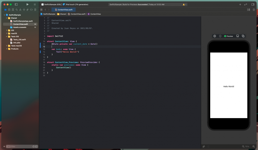
All SwiftUI View classes share the same structure. There’s a View struct defining the structure of the layout and functionality. There’s also a PreviewView struct serving as a helper for the emulator to display a preview of what you’re working with.
Now, you can see that in the ContentView struct, there’s a body variable of type View that defines the View. Therefore, any modification that you want to make to your View has to be done here.
As you’d see in all template code, the View contains a TextView object containing a “Hello World!” statement.
With all that established, we can start diving into the project.
Adding DatePickers With SwiftUI
Before you start adding your DatePicker element, let’s talk about State variables.
What’s a State variable?
In simple terms, it’s a variable (with the prefix @) that holds the “state” of the corresponding View. This way, the parent View and its hierarchy have some idea of the state of dynamic elements in the app. Otherwise, there’d be inconsistencies in the behavior of the app in terms of navigation.
So first, let’s add this variable to your code, like so:
Great! Now, let’s remove that “Hello World!” and add your DatePicker.
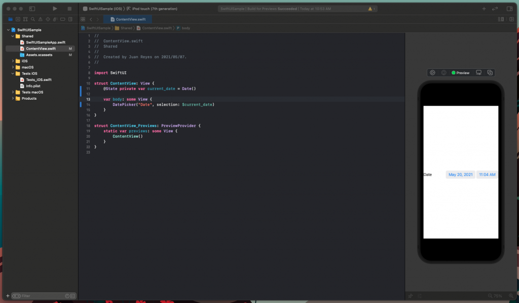
As you can see, the constructor is quite simple. It just requires a title and the state variable, which tells the DatePicker on which date to start.
You can test the DatePicker in the previewer by pressing the play button and interacting with it. Notice how it has all the expected functionalities right off the bat.
However, it doesn’t look very elegant all by itself. So let’s customize the appearance of your DatePicker.
Customizing Your DatePicker Appearance in SwiftUI
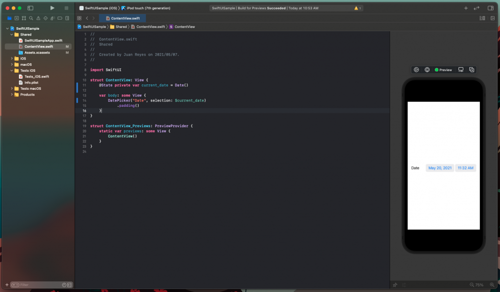
First, let’s add some padding to your View so it displays better on the screen.
The result looks like this.
Note: If you’re confused about why adding .padding() to the element did the trick or what this clause is, I suggest you read a bit about SwiftUI modifiers.
Now, the most straightforward part of a DatePicker to customize is, of course, the inputs. As you might have noticed, your current DatePicker has a date and a time field.
What if you only need the date field?
No problem. The displayedComponents parameter allows you to control what fields to display by providing an array with the flags of the components to show. In this case, you want to show the date field. So just set it as follows.
Several representations are available for a DatePicker, depending on the target platform for your project. In this case, we’ll focus on the iOS ecosystem.
To modify the representation of the DatePicker, we’ll use a modifier called datePickerStyle. This modifier accepts three different values.
- DefaultDatePickerStyle: This is the default style for the platform of development. In our case, this is equal to the CompactDatePickerStyle.
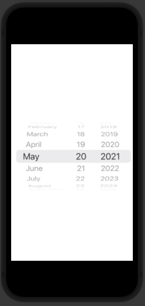
- WheelDatePickerStyle: This is the most familiar wheel style.
- GraphicalDatePickerStyle: This is the calendar view style.
- CompactDatePickerStyle: This is the default compact style that iOS introduced recently.
Here’s an example of the wheel style.
Feel free to try them all.
Finally, you can control the dates available to the user by introducing a range parameter to the constructor. To do this, you can initialize a range variable and pass it to the DatePicker constructor, like so:
Next, let’s add some functionality to your DatePicker.
Adding Functionality to Your Datepicker
First, let’s remove the modifiers and embed your DatePicker in a form.
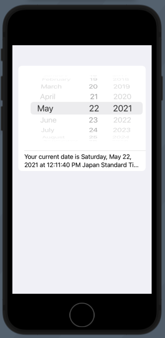
Now, place a Text element below the DatePicker. You want to make it so that the text indicates the selected date so the user can see it.
You can see now that when you change the date, it’s reflected in the text.
Very simple.
Let’s create some simple tests to ensure that the functionality stays solid.
Testing Your Work
With a complete implementation of DatePicker in your hands, you should create some tests to ensure that your code is clean and works as intended. To do that, you’ll be working with Xcode’s UI testing framework, which is already bundled in the project.
By opening the Test iOS group in the left bar, you can then open the Test_iOS.swift class file. Once it’s open, you can see that you have what you need to proceed to test your code.
Testing that your code works is quite simple. You can add the following code to the testExample() function and run it to illustrate how to test the picker.
Now, run that test. Find out whether the text is updating correctly when the DatePicker’s date changes.
Nice!
Find more info on how to implement testing in Xcode UI here.
Wrapping Up
Working as a Swift developer has always been one of my joys. I thoroughly enjoy the experience and feel that I can bring my full potential to the table with the tools and knowledge available. I hope this article serves a similar purpose for anyone looking for information on the Swift platform and DatePickers specifically.
Now you have a better understanding of the DatePicker element with a working example, and you have more testing options to ensure your work quality. I hope you can find a similar level of productivity and enjoyment in your development journey.
Also, if you’d like to learn about the world’s first no-code testing platform, check out Waldo. Its site has lots of valuable information about quality assurance and testing.
Automated E2E tests for your mobile app
Learn more about our Automate product, or try our live testing tool Sessions today.